Guardians Brand Guidelines and Resources
Use these resources to help you with fonts, colors, logos, and more, so you can stick with Guardians’ style.
Mission, Values, and Vision | Guardians Brand and Voice | Fonts | Colors | Logos | Images | Marketing Materials: Print | Marketing Materials: Digital | Style Guide
Mission and Vision
What we stand for day in and day out.
Mission
WildEarth Guardians protects and restores the wildlife, wild places, wild rivers, and health of the American West.
Values statement
We believe in nature’s right to exist and thrive. We act on this belief with compassion and courage by preserving the wild world. We defend wildness, empower life, end injustice, and stand for healthy, sustainable ecosystems and human communities. We embrace conflict, and cooperate without compromising our values. We execute the campaigns strategically and decisively, we mobilize, inform and inspire others, and we work to heal wounded landscapes. Our enduring and fierce advocacy leads us to success. We are A FORCE FOR NATURE.
Vision
WildEarth Guardians envisions a world where wildlife and wild places are respected and valued and our world is sustainable for all beings.
Tagline
A Force for Nature
The Guardians Brand and Voice
Evoking Guardians in what we say, write, and do.
All communication at Guardians should reinforce our brand qualities to the world and differentiate us from other groups in the space. Guardians’ Brand Storybook is a visual and verbal reflection of those qualities and helps us communicate correctly.
We are…
Innovative.
We won’t always win, but failure doesn’t daunt us. “Losing” is simply a redirect, a chance to try something new, creative or different—always with the end goal in mind.
Disruptive.
We shake up conversations. We ruffle feathers. If it’s comfortable, it’s not us. We are more personality. More passion. More voices. More cowbell.
Democratic (Not Autocratic)
We take on the old boys, the big established powers-that-be, the Goliaths, to protect the commons—for nature and for people.
Savvy
Our combination of honed street smarts, crafty intellect and on-the-ground presence allows us to successfully navigate the seemingly impossible.
Masterful
We take pride in our work. It’s strategic, expertly crafted, and deeply reverent of democracy, laws, governance, and science.
Balanced
Love fuels our work. Outrage fuels our work. We are fierce and compassionate, fiery and nurturing, powerful and protective. Like yin and yang, the contrasts unite in perfect harmony.
Bold
Daring, inventive and all too willing to defy convention, we might make you uncomfortable. Or we’ll be your hero, depending on which side of justice you stand. We don’t stand by idly. We don’t stay on the trail. We don’t even take the path less traveled. We go where we need to go, undaunted.
Each of us is a steward of the Guardians brand. Every piece of communications, be it a tweet or a presentation, has an opportunity to reinforce our unique difference with the world. When creating communication materials, ask yourself a few questions:
- Is it as bold as Guardians?
- Is it as focused, clear, and on-point as Guardians?
- Is it as impactful as Guardians?
If it’s not quite creating the impact you desire, please reach out to the Communications Team and we will try and help you refine your work.
Fonts
Building identity through type.
Choose among these three fonts.
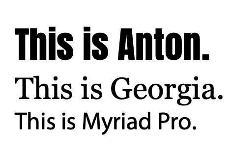
Anton – is BOLD to attract attention for the largest headlines and display copy and does not have italics. That copy is typically short and designed to capture the eye. It is NEVER to be used for paragraphs more than one or two sentences.
You can download Anton here.
Georgia – our readable, serif font (those little doodads/squiggles on the ends of letters) to use for body copy and any copy that you want people to read multiple paragraphs of. Look at our newsletter, it’s the font that makes up the stories. This font should come installed on your machine. NEVER to be used for headlines. Timesl is acceptable for plain text documents, along with any court-mandated fonts.
Myriad Pro – a smaller, sans serif font. Use this font for sidebar headlines, sidebar paragraphs, presentations, etc. It works well for small chunks of copy rather than running copy that would be the bulk of a story or report. NEVER to be used for headlines, can be used for subheads or sidebar style headlines. Arial is acceptable for plain text documents, along with any court-mandated fonts.
You can download Myriad Pro here.
Fonts in use
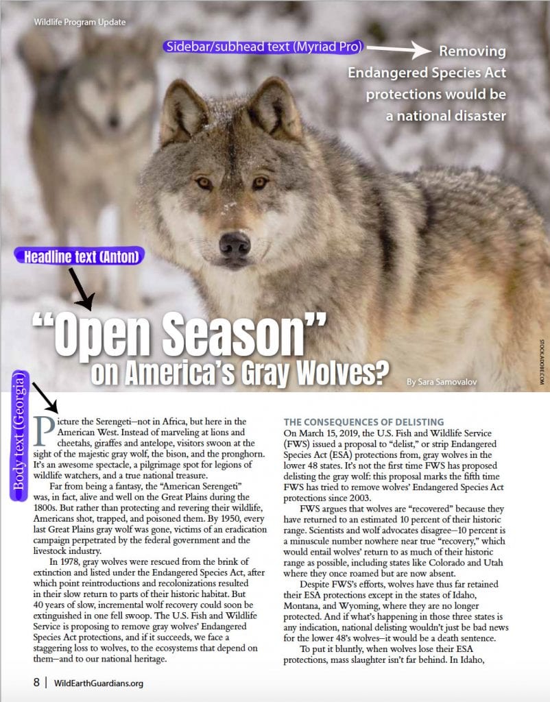
Here’s a page from Guardians’ summer 2019 newsletter so you can see font use in use.
Colors
Hues that designate our brand.
Rust and green form the basis of Guardians’ colors palette, including Guardians’ logo.

#A64D1C
rgb(166,77,28)
cmyk(0,54,83,35)

#949C2A
rgb(148,156,42)
cmyk(5,0,73,39)
Other supporting colors have been chosen to create a feeling of boldness and impact to create and catch attention. There are times your materials may need other colors; please choose colors that maintain that feeling. Download a Word document of all Guardians’ color swatches here.
RGB/CMYK conversions produced from Hex at http://www.convertacolor.com/

#E4922A
rgb(228,146,42)
cmyk(0,36,82,11)

#F4BA2E
rgb(244,186,46)
cmyk(0,24,81,4)

#FFDC4F
rgb(255,220,79)
cmyk(0,14,69,0)

#205B80
rgb(32,91,128)
cmyk(75,29,0,50)

#3A9CC1
rgb(58,156,193)
cmyk(70,19,0,24)

#C0C845
rgb(192,200,69)
cmyk(4,0,66,22)

#541E61
rgb(84,30,97)
cmyk(13,69,0,62)

#833FA3
rgb(131,63,163)
cmyk(20,61,0,36)

#373737
rgb(55,55,55)
cmyk(0,0,0,78)

#49919D
rgb(73,145,157)
cmyk(54,8,0,38)

#49BABA
rgb(73,186,186)
cmyk(61,0,0,27)

#EFEFEC
rgb(239,239,236)
cmyk(0,0,1,6)
Logos
![]()
Our single-most identifiable mark.
Please use the Guardians’ logos 2020 that can be found here we are not using our 30th anniversary logo anymore. There are logos in multiple formats depending on use. Please choose from the choices below to determine what to use or send to a recipient and please send the entire folder of logos to the recipient.
Larger than 1″ and on light background (First Choice, Use this wherever possible)
Larger than 1″ and on dark background
Smaller than 1″ and on Light Background
Smaller than 1″ and on a Dark Background
When it must be horizontal (last choice)
NEVER: alter the position of the tagline relative to the logo, use the logo without at least our name, “WildEarth Guardians,” or change the colors of the logos or any other logo elements.
Images
Tell your story through pictures.
Every image has something to communicate. Whether to feature a majestic species or to bring attention to an environmental threat, the image must strike a chord with its audience. When selecting imagery for your materials, look for rich, saturated colors. Ensure that the proper credit is given to the photographer.
The best imagery is simple and uncluttered with a clear representation of the subject. We’re after connective and emotionally driven imagery and have two overarching rules: close or far (minimize the middle ground). First is close and intimate with a focus, which could be an animal, people, or an event. Find the connective point, what is important that we are trying to share then focus on it with cropping. Second is beautiful broad overview imagery, this could be landscapes or events where we see a large number of people; show the big picture as long as someone can digest it. Most images are inherently shot or cropped in that middle zone where there isn’t a focus, they’re accurate but boring. We have lots of imagery like this in our archives, no focus, just a snapshot, it’s up to us to select and crop images well.
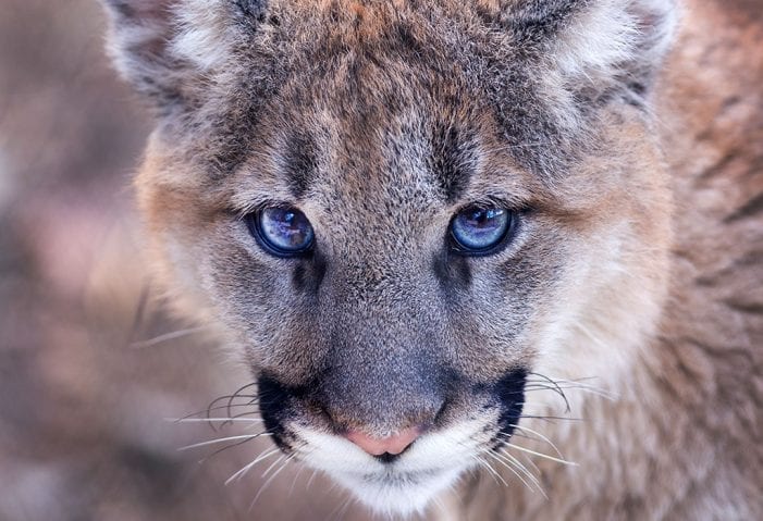
Close: a mountain lion face. Connective, powerful.
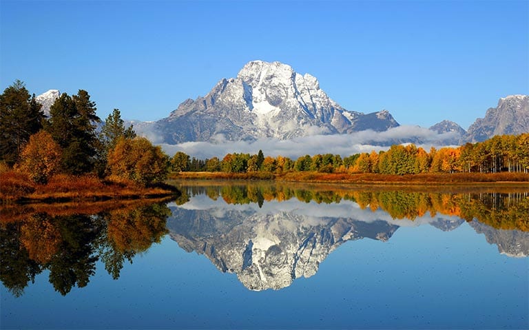
Far: the Tetons. Gives a feeling of awe, landscape and striking beauty.
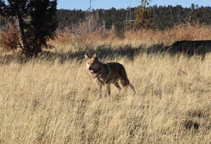
Middle ground: a Mexican wolf. Very boring and not engaging, though accurate.
Marketing Materials: Print
Letterhead
Updated Guardians letterhead, with new addresses and the 30th anniversary logo, can be found here.
Business cards
To order new Guardians-branded business cards, please follow the process here.
Fact sheets
Fact Sheets are a critical way to educate members and the general public on campaign-related information. Use visuals to help tell your story and make your piece engaging to your readers.
Guardians’ graphic designer, Janice St. Marie, can make beautiful, Guardians-branded fact sheets like the one below as you need them. Contact her at mariposaflutterby@icloud.com.
Wild at Heart
Guardians’ print newsletter, Wild at Heart, goes out three times annually and is used as a key communication vehicle to our members.
You can find current and back issues of Wild at Heart electronically on our website, here.
For print copies of Wild at Heart, contact Caitlin Muret.
Marketing Materials: Digital
E-comms
For more information on the emails Guardians sends out and what they look like, please consult this page.
E-cards
To add or change an e-card (the signature card at the bottom of your email), follow this process.
Powerpoint Presentations
We now have a 30th anniversary Powerpoint template, available here. This template is brand new and we would like to tweak it to your specifications as needed. If you pilot the use of this template, please let the Comms team know of any recommended changes.
Here is that Powerpoint template without the 30th anniversary logo, in case you’re using it in 2020 or beyond.
Want to be inspired by colleagues’ previous Powerpoint presentations? You’ll find them in this folder.
Style guide
Here is the working version of Guardians’ style guide, which should evolve over time to suit the needs of the organization. If you have questions, comments, or concerns about the style guide, email the Comms team.
